There’s a reason you instinctively feel cozier in a room painted terracotta than
one washed in icy blue. Warm colors have a kind of gravitational pull — they draw
you in, raise your energy, and make spaces feel alive. Whether you’re decorating
your living room, choosing an outfit, or designing a brand identity, understanding
the difference between warm and cool colors is one of the most powerful tools you
can have.
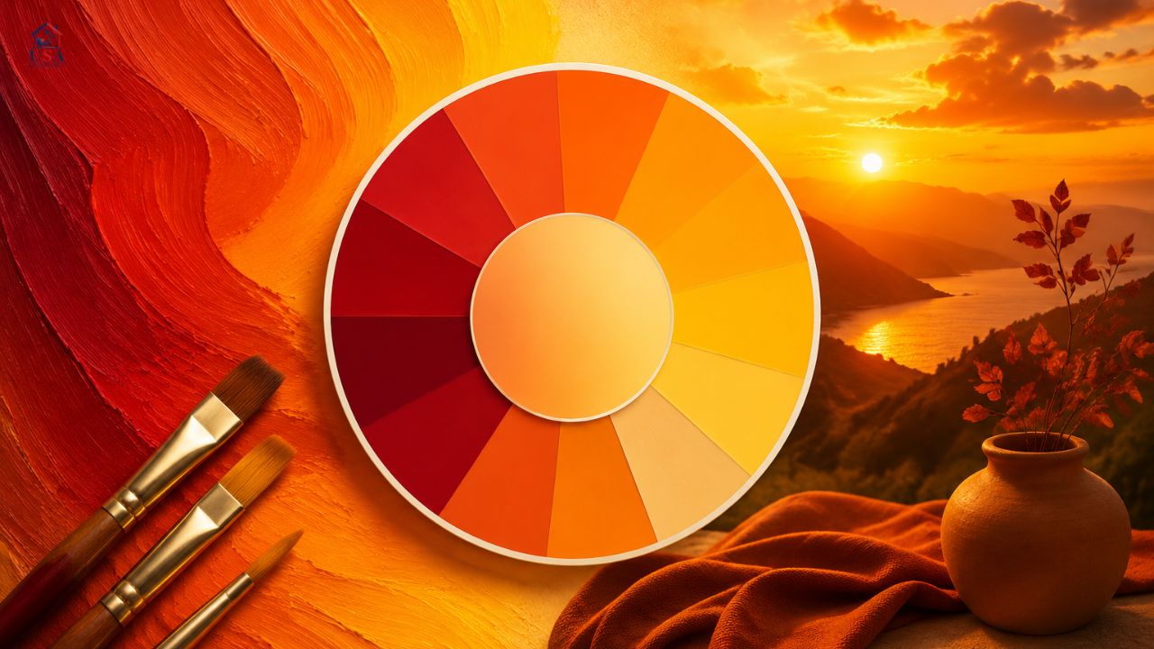
So, what are warm colors? Simply put, they are the hues on the color wheel that
remind us of fire, sunlight, and heat — reds, oranges, yellows, and the many
tones that blend between them. The definition of warm colors traces back to color
theory developed in the 18th century, but the emotional responses they trigger
are far older than any academic framework.
This guide covers everything — from the scientific definition of warm colors and
examples you’ll recognize, to their psychological effects, their role in interior
design and art, and how they stack up against cool colors in everyday life. By
the end, you’ll see color the way designers do: not just as aesthetics, but as a
language.
Whether you’ve been searching for “what are warm tones” or debating whether black
is a warm or cool color, you’re in the right place. Let’s get into it.
WHAT ARE WARM COLORS? A CLEAR DEFINITION
The warm color definition in color theory is straightforward: warm colors are
hues that fall on the red-to-yellow side of the color wheel. This encompasses
reds, oranges, yellows, and warm-leaning pinks and browns. They are called “warm”
because they are visually and psychologically associated with heat sources — the
sun, fire, and molten lava.
In the traditional color wheel used by painters and designers, colors are often
divided into two camps: warm colors and cool colors. The dividing line typically
runs between red-violet and yellow-green. Everything from red to yellow — moving
through orange — sits in the warm zone. Everything from green-blue to violet sits
in the cool zone.
PULL QUOTE:
“Warm colors advance toward the viewer; cool colors recede. Master this,
and you master the illusion of depth.” — Principle of Color Theory
A critical nuance worth knowing: even individual colors can be warm-toned or
cool-toned. For instance, a warm vs cool orange distinction exists — a warm orange
leans toward red, while a cool orange leans toward yellow-green. The same applies
to grays — warm vs cool gray is a real and meaningful distinction in design and
paint colors. This is why debates like “warm black vs cool black” or “cool orange
vs warm orange” matter so much in professional practice.
EXAMPLES OF WARM COLORS YOU SEE EVERY DAY
The best way to cement the concept is with real, tangible examples of warm colors.
These are hues you encounter constantly — in nature, in your home, in your
clothing. Here are the most recognized ones:
These warm color examples span from bold and saturated to soft and muted. A warm
color palette in interior design, for instance, might include terracotta, dusty
rose, mustard, and brick — all of which carry that signature heat-and-energy
quality without being harsh or overpowering.
If you’ve ever asked “what colors are warm colors?” and wondered about edge cases
— yes, certain pinks, peaches, corals, and even warm browns are included. Warm
tones are broader than just red, orange, and yellow; the whole family extends
into related hues that retain that psychological warmth.
The Six Core Warm Colors
Many color educators identify the core warm hues as six. Here’s the standard
list for “what are the 6 warm colors”:
- Red — The most powerful and emotionally intense warm color.
- Red-Orange — The bridge between passion and energy.
- Orange — Enthusiastic, creative, and sociable.
- Yellow-Orange— Cheerful and attention-grabbing.
- Yellow — Optimistic, bright, and mentally stimulating.
- Yellow-Green — A transitional hue that leans warm depending on context.
For those who want a short answer to “what are three warm colors?” — stick with
red, orange, and yellow. These are the undisputed core of every warm color scheme.
WARM COLORS VS COOL COLORS: UNDERSTANDING THE FULL SPECTRUM
To truly understand warm colors, you have to know what they’re contrasted against.
The warm vs cool colors debate isn’t just academic — it’s one of the most
practically useful concepts in art, design, fashion, and even photography.
The difference between warm and cool colors goes beyond the spectrum. In art,
painters use this dynamic to create depth — placing warm hues in the foreground
and cool colors in the background to simulate atmospheric perspective. This
technique is used by everyone from Renaissance masters to modern illustrators.
Cool Colors: A Quick Overview
Cool colors are the counterparts to warm ones. Cool colors include blue, green,
purple, and their many variations. The definition of cool colors mirrors the warm:
they are hues associated with water, sky, and coolness — things that recede from
us in nature. Cool colors examples range from cerulean and navy to sage green
and violet.
The cool colors meaning is often tied to serenity, reliability, and calm. Where
warm colors excite, cool tones slow the pulse down. This is why cool tones vs
warm tones is such a common debate in interior design: the choice between them
fundamentally changes the emotional character of a space.
WHAT DO WARM COLORS REPRESENT? PSYCHOLOGY AND MEANING
Color psychology is a well-studied field, and the warm colors meaning is one of
its clearest findings. These hues consistently evoke specific emotional and
physiological responses across cultures.
What Emotions Do Warm Colors Evoke?
• Red: Passion, urgency, love, danger, power. Red raises heart rate
and is often used in clearance sales and stop signs.
• Orange: Creativity, enthusiasm, social warmth, playfulness. Orange is
one of the most inviting colors — energetic without aggression.
• Yellow: Optimism, clarity, happiness, and sometimes anxiety in excess.
Yellow is mentally stimulating and associated with sunlight.
• Gold/Amber: Luxury, tradition, richness, and stability. Gold sits at the
prestige end of the warm spectrum.
• Peach/Coral:Warmth, tenderness, approachability. These softer warm hues
communicate friendliness and care.
If you’ve ever wondered “what do warm colors make you feel?” — the honest answer
is: activated. They stimulate. They encourage action. What do warm colors
represent in the broadest sense? Life, energy, fire, and the sun.
What Are Inviting Colors?
What colors are inviting? Warm ones — almost always. Terracotta, burnt sienna,
golden yellow, and peach are perennial favorites for hospitality-focused spaces
because they communicate welcome. Real estate staging, restaurant design, and
hotel lobbies all lean heavily on warm, inviting colors. The warm color meaning
in social contexts is fundamentally about openness and comfort.
WARM COLORS IN INTERIOR DESIGN AND ARCHITECTURE
When it comes to warm colors interior design, the goal is almost always to create
spaces that feel inhabited, cozy, and human. Cold, neutral interiors might look
sleek in photos, but warm tones interior design makes a house feel like a home.
Warm Paint Colors for Every Room
• Living rooms: Terracotta, ochre, warm beige, and rust — make the space
feel social and inviting.
• Dining rooms: Deep warm reds and burnt oranges stimulate appetite and
conversation.
• Bedrooms: Soft, muted warm color tones — blush, dusty peach, warm
cream — create intimacy without over-stimulating.
• Kitchens: Sunny yellows and warm whites make kitchens feel bright,
energetic, and welcoming.
• Home offices: Gold and amber accents add focus and warmth without
distraction.
The warm color palette interior design principle also works in combination:
pairing a warm background with cool accent pieces (teal cushions, navy throws)
creates visual balance. The interplay of warm and cool colors within a single
room is one of the most sophisticated moves in interior design.
Warm vs Cool Color Palette in Interior Spaces
The warm vs cool color palette debate is particularly relevant in open-plan
spaces, where a warm color scheme in the dining area might need to transition
gracefully into a cooler-toned kitchen. Designers often use the warm and cool
color scheme approach — anchoring with one dominant temperature and using the
other as a counterpoint to prevent monotony.
WARM COLORS IN ART: DEFINITION AND APPLICATION
The warm colors art definition used in painting and illustration is essentially
the same as in general color theory — hues that evoke heat and energy — but
artists use this knowledge far more actively. In painting, warm art definition
extends to the understanding that light sources (like the sun or a candle) cast
warm-toned light, while shadows often appear in cool tones.
Using Warm and Cool Colors for Contrast and Depth
The classic technique of warm and cool colors design in fine art involves
alternating temperature to create vibrancy. When a warm color is placed directly
next to a cool color, both appear more intense — a phenomenon called simultaneous
contrast. Impressionist painters like Monet exploited this masterfully.
Bright warm colors like cadmium red and cadmium yellow are go-to tools for
creating focal points. Warm vibrant colors and cool bright colors placed in
opposition create a visual electricity that flat monochrome palettes cannot
achieve.
WARM TONES VS COOL TONES IN FASHION AND SKIN UNDERTONES
Beyond spaces and canvases, warm tones vs cool tones is one of the most searched
topics in personal styling. Understanding your skin’s undertone determines which
colors will complement your complexion.
What Are Warm Tone Colors for Skin?
Warm tone colors for skin refer to complexions with golden, peachy, or yellow
undertones — think olive skin, golden brown skin, and warm beige. People with
warm undertones tend to look their best in warm toned colors like terracotta,
rust, camel, mustard, and gold.
WARM VS COOL TONES — SKIN UNDERTONE GUIDE:
• Warm undertones: Gold, peach, yellow base. Best in gold jewelry,
earth tones, warm color clothing.
• Cool undertones: Pink, red, blue base. Best in silver jewelry,
jewel tones, cool color clothing.
• Neutral undertones: A mix of both — can pull off warm and cool tones.
Cool tones colors in fashion — ice blue, lavender, charcoal — contrast directly
with the warm color family. Cool colors clothes look striking on cool-toned
individuals just as warm toned color palette choices flatter warmer skin.
IS BLACK A WARM OR COOL COLOR? (AND OTHER EDGE CASES)
“Is black a warm or cool color?” is one of the most common questions in color
theory. The honest answer: it depends on the pigment. Warm black vs cool black:
a warm black has subtle brown or red undertones, while a cool black leans blue
or green. The same distinction applies to grays (warm vs cool gray).
Is Green a Warm or Cool Color?
Green is traditionally grouped with cool colors, but a yellow-green like
chartreuse reads as warm, while a blue-green like teal reads as distinctly cool.
Is green a cool color? Generally yes — but context and mixing determine temperature.
Is Pink a Warm Color?
It can be. Coral pink, salmon pink, and peach are warm. Dusty rose and magenta
lean cool. The undertone tells the story. Understanding these nuances takes you
from basic color knowledge into true fluency.
BUILDING A WARM COLOR SCHEME: PRACTICAL TIPS
Whether you’re designing a room, a brand, or a painting, building a warm color
scheme requires intention. Here are the principles professionals rely on:
Tips for Using a Warm and Cool Color Palette Together
- Start with a dominant temperature.
Decide whether your space or design is primarily warm or cool, then use
the opposite as an accent. A warm and cool color palette split 50/50
can feel chaotic. - Vary saturation.
A warm color palette doesn’t have to be loud. Mixing high-saturation
oranges with soft, muted peaches creates depth and sophistication. - Use neutrals to mediate.
Warm creams, taupes, and beiges are ideal bridges between warm and
cool colors. - Remember — light changes color.
Warm paint colors look different under natural daylight versus
incandescent bulbs. Always test swatches in actual lighting conditions. - Think in warm color schemes.
Analogous warm color schemes (red + orange + yellow) are harmonious.
Complementary schemes (orange + blue) create drama and contrast.
Warm Color Scheme Examples
• Autumnal: Burnt orange, deep red, mustard yellow, warm brown —
cozy, seasonal, and timeless.
• Desert Sunset: Terracotta, sand, peach, dusty rose, and cream —
sophisticated and serene.
• Tuscan Kitchen:Golden yellow, rustic orange, olive, and off-white —
warm without being heavy.
• Bold & Modern: Scarlet red + bright orange + black — high contrast,
energetic, and contemporary.
FREQUENTLY ASKED QUESTIONS ABOUT WARM COLORS
Q: What are warm colors, exactly?
Warm colors are hues on the red-to-yellow side of the color wheel, including
reds, oranges, yellows, golds, and warm pinks. They are called warm because they
are visually and emotionally associated with fire, sunlight, and heat. The warm
color definition in color theory is any hue that falls between red-violet and
yellow-green on the wheel.
Q: What are the main differences between warm vs cool colors?
The difference between warm and cool colors is primarily about emotional and
visual effect. Warm colors are energizing, advancing (appearing closer), and
associated with passion and activity. Cool colors are calming, receding (feeling
farther away), and associated with tranquility and focus.
Q: What do warm colors represent or symbolize?
What do warm colors represent varies by specific hue, but broadly they symbolize
energy, passion, creativity, and warmth. Red represents love and urgency; orange
represents enthusiasm; yellow represents optimism. In art and design, warm colors
meaning is often tied to action, social connection, and vitality.
Q: What are cool colors and what do they include?
Cool colors are hues on the blue-to-purple side of the color wheel. Cool colors
include blue, teal, green, purple, lavender, and their many variations. What do
cool colors represent? Calm, reliability, and peace. Cool colors definition: any
hue that evokes water, sky, and coolness rather than fire or sunlight.
Q: Is black a warm or cool color?
Is black a warm color? It depends on the pigment. Warm black vs cool black:
a warm black has brownish or reddish undertones (like ivory black in paint),
while a cool black leans blue or green (like lamp black). The distinction
matters enormously when selecting paint for interiors or mixing colors.
Q: What are some warm colors suitable for interior design?
For warm colors interior design, excellent choices include terracotta, burnt
orange, mustard yellow, golden beige, rust, coral, and warm cream. Warm paint
colors like these create inviting, cozy spaces. For sophistication, try soft warm
colors like dusty peach or muted amber.
Q: What is the difference between warm tones and cool tones in fashion?
Warm tones vs cool tones in fashion relates to skin undertones. Warm tones
(golden, peach, yellow base) are flattered by earthy warm hues — terracotta,
gold, camel, rust. Cool tones (pink, blue base) suit jewel tones and icy shades.
Knowing whether you’re warm or cool toned is the foundation of personal color
analysis.
Q: What are considered warm colors vs what are considered cool colors?
What are considered warm colors: red, orange, yellow, gold, peach, coral, rust,
amber, and warm pinks and browns. What colors are considered cool: blue, green,
purple, teal, lavender, and cool-leaning grays. Edge cases (like pink or green)
depend on their specific undertone.
Q: How do warm and cool colors work together in design?
Warm and cool colors create dynamic contrast when used together. Placing a warm
hue against a cool one makes both appear more vivid — the principle of
simultaneous contrast. A warm and cool color scheme typically works best with one
temperature dominant and the other used as accent, creating a balanced, vibrant
composition.
CONCLUSION
Color is never just decoration. It is one of the most immediate and powerful
forms of nonverbal communication we have. Warm colors — from the urgency of a
deep red to the gentle glow of a golden amber — carry meaning, trigger emotion,
and shape how we experience spaces, art, and even the people around us.
Understanding the full picture of warm colors and cool colors, their definitions,
their emotional resonance, and their practical applications gives you a genuine
advantage — whether you’re painting a room, creating a brand, styling an outfit,
or simply trying to understand why certain spaces feel alive while others feel flat.
The next time you walk into a restaurant and feel immediately at ease, glance at
the walls. The next time an advertisement makes you feel an unexpected surge of
excitement, look at its palette. Chances are, warm tones are doing a lot of
quiet, powerful work — and now you know exactly how.