Article
Color does more to a workspace than most people realize. The shade on your office walls can quietly lift your energy, ease afternoon fatigue, help you focus through a packed schedule, or make a client feel immediately at ease the moment they walk in. Choosing the right modern office paint colors is not a purely decorative decision — it’s a practical one that shapes how people feel and perform every single day.
Whether you’re refreshing a home office, redesigning a business office, or planning a full commercial office renovation, this guide covers everything you need to know: the best office color schemes, what different colors do to mood and productivity, how to handle tricky spaces like small offices or windowless rooms, and how to put it all together into a palette that looks sharp and feels right.
Why Office Paint Color Actually Matters
Paint is one of the most affordable and highest-impact upgrades you can make to any workspace. Yet most offices end up with generic beige or flat white by default — not because those are the best choices, but because nobody stopped to think about it.
Research in environmental psychology consistently suggests that color influences mood, energy, and concentration. Cool blues and greens tend to calm and focus. Warm yellows and oranges can boost creativity and energy. Neutrals provide visual quiet that lets the work itself take center stage. Bold accent walls add personality without overwhelming a room.
The best office color isn’t one universal shade. It depends on the type of work being done, the natural light in the room, the size of the space, the existing furniture, and the impression you want to make. A law firm and a design studio will need completely different approaches — and they should.
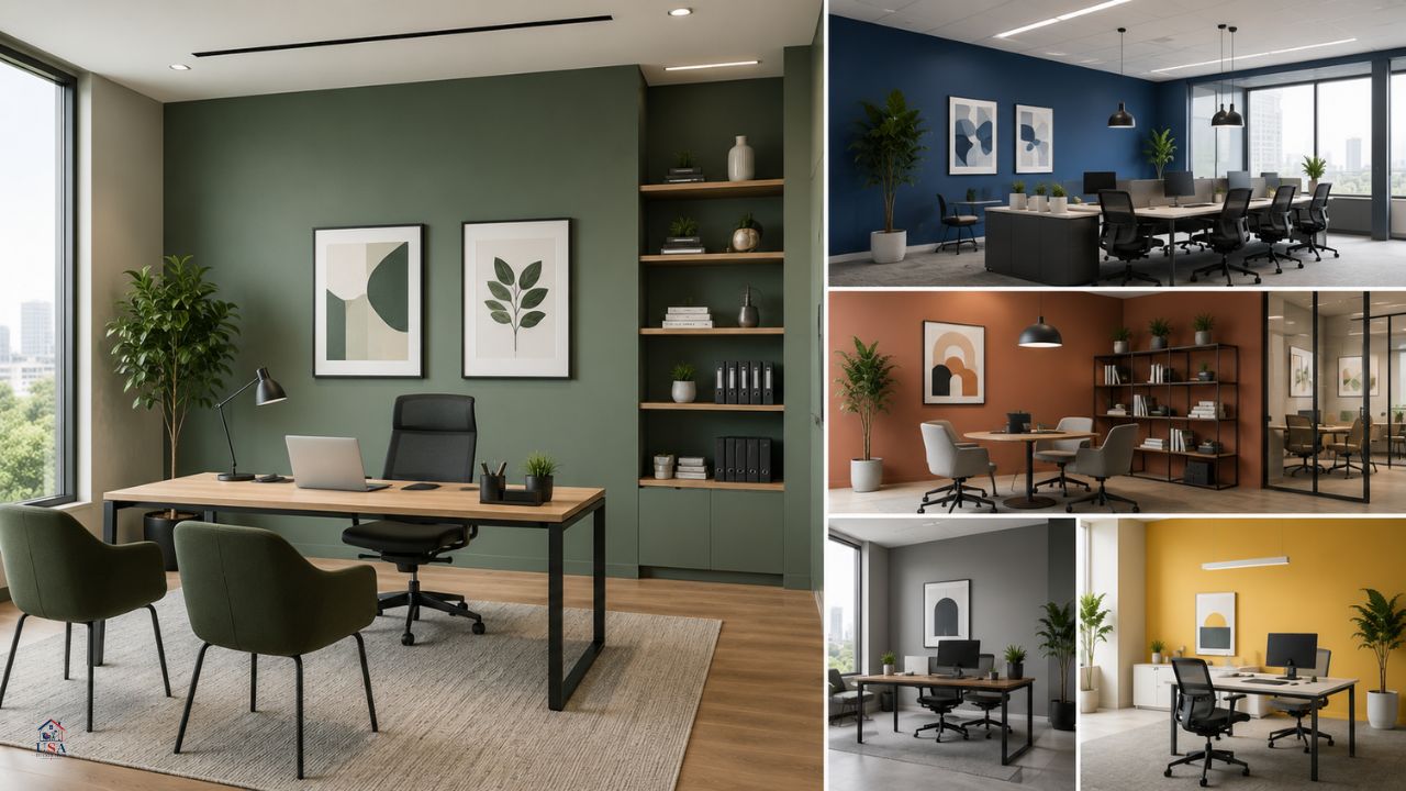
The Best Modern Office Paint Colors by Category
Calm and Focused: Blue and Blue-Gray Tones
Blue office paint colors are among the most popular choices for offices — and for good reason. Blue is consistently linked to focus, calm, and mental clarity. It works especially well for task-heavy environments where concentration is essential: accounting offices, law firms, writing rooms, tech companies, and home offices used for deep work.
Best blue shades for offices:
- Soft slate blue – Sophisticated and calming without feeling cold
- Dusty navy – Adds depth and authority, ideal for professional business settings
- Pale sky blue – Light, airy, and perfect for small offices that need to feel bigger
- Steel blue-gray – A modern hybrid that pairs beautifully with white trim and wood furniture
Blue office colors work well with white ceilings, warm wood tones, and natural fiber furniture. For a polished look, pair a blue office paint wall with brass or gold hardware accents.
Fresh and Energizing: Green Office Paint Colors
Green office paint colors have surged in popularity in recent years, and it’s easy to see why. Green sits at a natural intersection of calm and energy — it refreshes without overstimulating, and it brings a subtle connection to the natural world that feels good in enclosed spaces.
Green office paint is particularly effective in home offices, creative studios, wellness-adjacent businesses, and any workspace where people want to feel both grounded and inspired.
Best green shades for office walls:
- Sage green – Soft, muted, and universally flattering; works in almost any lighting condition
- Forest green – Rich and sophisticated; great for accent walls or small offices with high ceilings
- Mint – Fresh and light; ideal for modern, minimal office setups
- Olive green – Earthy and warm; pairs well with terracotta, linen, and wood
Green office ideas often work best when layered with natural textures — rattan, wood, stone, or linen — to create a cohesive, organic aesthetic. Green office walls with warm wood furniture make for one of the most timeless office color combinations available.
Clean and Professional: White, Off-White, and Light Neutrals
White will never go out of style in professional settings, and for good reason. It maximizes light, makes spaces feel larger, and creates a clean visual backdrop that works with virtually any furniture or decor.
The key is choosing the right white. Flat bright white can feel sterile and harsh, especially under fluorescent lighting. Consider:
- Warm white (with yellow or pink undertones) – Creates a softer, more welcoming feel
- Cool white (with blue or gray undertones) – Crisp and modern, suits contemporary offices
- Cream or soft ivory – More sophisticated than white, more neutral than beige
Off-white tones work particularly well for small office paint colors because they open up the room without the coldness of stark white. They also make an excellent choice for business office paint colors in client-facing spaces where the look needs to feel polished but approachable.
Warm and Inviting: Warm Neutrals, Taupes, and Greiges
For offices that need to feel warm and welcoming — lobbies, reception areas, consulting rooms, or therapy practices — warm neutrals are the go-to choice. These tones sit between beige and gray (often called “greige”) and offer the softness of a neutral without the blandness.
Good warm neutral office colors:
- Warm greige – The Swiss Army knife of office neutrals; works with everything
- Soft taupe – Elegant, calm, slightly earthy
- Sand or wheat – Bright but warm; great for rooms with limited natural light
- Warm terracotta (light versions) – Bold yet grounding; works beautifully as an accent
These shades are especially effective as best office paint colors for wellness offices, legal practices, boutique businesses, or any environment where the goal is to immediately put visitors at ease.
Sophisticated and Moody: Dark Office Paint Colors
Dark office paint colors have become one of the most sought-after trends in modern workspace design. Far from feeling oppressive, dark colors — when used well — make offices feel intimate, focused, dramatic, and unmistakably sophisticated.
Dark paint colors for office walls:
- Charcoal gray – Modern and timeless; pairs with almost any furniture style
- Deep navy – Feels rich and authoritative; perfect for executive offices
- Forest green (dark) – Luxurious and organic; trending strongly in contemporary design
- Warm black (with brown or red undertones) – Bold and commanding; not for the faint-hearted, but stunning when done right
Dark office color ideas work best in rooms with enough natural light or well-planned artificial lighting. They pair especially well with white or cream trim, warm wood accents, and statement furniture. One common and effective approach is a dark office accent wall paired with lighter walls on the remaining three sides — giving the room drama without closing it in.
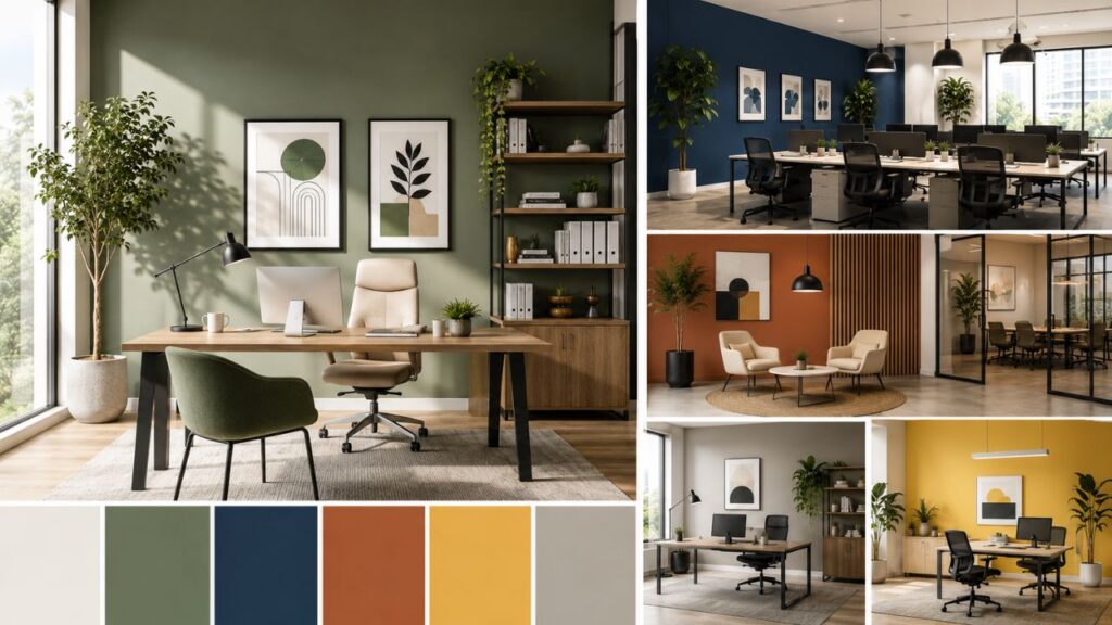
Bold and Creative: Accent Colors and Statement Walls
Not every office needs to commit to one color on all four walls. Office accent wall colors are a great way to inject personality, brand identity, or visual energy into a workspace without overwhelming it.
Office color combination ideas for accent walls:
- Navy blue accent wall + soft white walls
- Forest green accent wall + warm cream or greige
- Terracotta accent wall + white + wood tones
- Charcoal accent wall + light gray or white surroundings
- Mustard yellow accent wall + white + black accents (creative studios)
Two-tone office walls — where the lower portion is painted a deeper color than the upper half, often separated by a chair rail — add visual interest and architectural detail to otherwise plain rooms.
Office Color Schemes by Workspace Type
Home Office Paint Colors
The home office presents a unique challenge: it needs to feel professional enough to work in, but it also lives inside a home, so it should feel comfortable and personal.
The best home office paint colors depend on the room’s light and your work style:
- North-facing rooms (less natural light): Choose warmer tones — creams, warm whites, soft sage, warm greige — to counter the cool, flat light
- South-facing rooms (plenty of natural light): Almost any color works; this is where deeper or bolder shades shine
- Small home offices: Stick to lighter values — pale blues, soft greens, off-whites — to maintain an open feel
- Dedicated creative spaces: Give yourself permission to go bolder — a green home office, a navy feature wall, or a warm terracotta can fuel creative energy
Popular home office color scheme combinations:
- White + sage green + natural wood
- Navy blue + warm white + brass
- Charcoal + light gray + white
- Warm greige + off-white + terracotta accents
Small Office Paint Colors
Small office paint colors require a bit more strategic thinking. The goal is usually to make the space feel as open, light, and uncluttered as possible.
Best practices for small office colour schemes:
- Go light – Pale and light-reflective colors visually expand a room
- Use one consistent color – Too many colors in a small space feel chaotic
- Avoid dark colors on all four walls (a single dark accent wall is fine)
- Matte finishes reduce glare and make small rooms feel quieter
- Mirror-friendly tones – Light blues and greens make mirrors more effective at bouncing light
Best small office paint colors: soft white, pale blue-gray, light sage, warm ivory, and greige.
Business and Professional Office Paint Colors
Business office paint colors need to balance brand identity, client perception, and employee well-being. For corporate and professional office environments, here are the key considerations:
- Lobby and reception colours: First impressions matter. Warm neutrals, soft blues, and greens communicate calm confidence. Avoid chaotic or overly trendy colors in these high-traffic impression zones.
- Conference room color ideas: Rooms used for meetings and presentations benefit from colors that keep people alert — medium blue, gray-blue, or green are classic choices. Avoid very dark colors that feel oppressive in groups.
- Executive offices: Deeper, richer tones like navy, charcoal, or warm dark green tend to feel appropriate for leadership spaces.
- Open-plan offices: Neutral base tones (greige, warm white, light gray) with color used sparingly as accents through furniture, artwork, or feature walls
Corporate office color schemes are increasingly moving away from institutional beige toward more thoughtful palettes that balance professionalism with human warmth — an approach that research suggests improves employee satisfaction.
Office Color Psychology: What Each Color Does
Understanding office color ideas from a psychological angle helps you make smarter choices:
| Color | Psychological Effect | Best For |
|---|---|---|
| Blue | Calm, focus, trust | Law firms, tech, finance, task-heavy work |
| Green | Balance, renewal, calm energy | Creative studios, wellness, open-plan offices |
| Yellow | Optimism, creativity, alertness | Design studios, brainstorming spaces, creative work |
| White/Off-white | Clarity, space, professionalism | Any office type; especially small spaces |
| Gray | Sophistication, neutrality, balance | Corporate, executive, modern minimalist |
| Warm neutrals | Comfort, welcome, approachability | Reception, consulting, healthcare |
| Dark navy/green | Depth, authority, luxury | Executive suites, high-end professional offices |
| Red (accent only) | Energy, urgency, bold personality | Accents only — too stimulating for full walls |
Office Color Combinations That Work
One of the most practical skills in office interior color planning is knowing which colors work together. Here are some proven office color combination pairings:
Classic and professional:
- White + navy blue + natural wood
- Light gray + charcoal + white trim
- Soft greige + warm white + brass hardware
Modern and fresh:
- Sage green + warm white + terracotta accents
- Dusty blue + cream + warm oak
- Off-white + forest green + black trim
Bold and distinctive:
- Deep navy + gold accents + white
- Charcoal + warm wood + linen
- Olive green + sand + rattan
Calm and minimal:
- Pale blue-gray + white + glass and chrome
- Warm white + soft gray + natural linen
- Light greige + muted sage + warm neutrals
When planning your office color scheme, start with the largest element (walls), then layer in the floor, furniture, and accent pieces. The 60-30-10 rule is a helpful guide: 60% dominant color (walls/floors), 30% secondary color (furniture/rugs), 10% accent color (accessories, artwork, hardware).
Common Mistakes to Avoid
Even the most thoughtful office interior painting plans can go wrong. Here are the most common mistakes:
1. Ignoring the lighting A color that looks perfect on a paint chip or screen can look completely different under warm incandescent bulbs versus cool LED lighting or daylight. Always test paint swatches on the actual walls in your office at different times of day before committing.
2. Choosing a trendy color without considering longevity Trends shift. A color that feels cutting-edge today may feel dated in three years. Choose colors you genuinely connect with, and think about how they’ll age alongside your furniture and brand.
3. Forgetting about the ceiling and trim Most people obsess over wall color and forget that ceilings, trim, and baseboards are part of the picture. A warm wall color with a starkly cool white ceiling can feel jarring. Match undertones across all surfaces.
4. Going too dark in a small, windowless office Dark colors can be stunning, but paint colors for office with no windows should lean lighter unless you have exceptional artificial lighting. In low-light conditions, dark colors can make a space feel uncomfortably cave-like.
5. Skipping primer Especially important when going from a dark color to a light one, or painting over a stained surface. Skipping primer results in uneven color and often requires multiple extra coats.
6. Painting the whole room before testing Buy sample pots and paint large swatches (at least 12″ x 12″) directly on the wall. Live with them for a few days before making a final call.
Finish Matters Too: Choosing the Right Paint Sheen
The color you choose is only half the equation. The finish — or sheen level — also dramatically affects how the color looks and how well the paint holds up.
- Flat/Matte – No shine; hides imperfections; ideal for ceilings and low-traffic office walls; shows marks more easily
- Eggshell – Slight sheen; easy to clean; the most popular choice for office walls
- Satin – More shine; very washable; good for high-traffic areas and trim
- Semi-gloss/Gloss – High sheen; used for trim, doors, and accents; durable and easy to clean
For most office interior painting projects, eggshell is the safest and most versatile finish for walls. It reflects just enough light to make colors look rich, without the visual noise of a glossy wall.
FAQ: Modern Office Paint Colors
What is the best color to paint an office for productivity?
Blue and green tones are most consistently linked to focus and productivity. Soft blues encourage calm concentration, while greens balance energy and calm. The best choice depends on your specific work — creative roles may benefit from slightly warmer tones, while analytical work often thrives under cooler hues.
What office paint colors make a small office look bigger?
Light, cool tones work best for small offices — pale blue-gray, soft white, light sage green, and warm ivory all help a room feel more spacious. Keeping the ceiling lighter than the walls and using a consistent color palette without too many contrasts also helps.
What are the most professional office paint colors?
For client-facing and corporate environments, soft blues, warm neutrals, greige, light grays, and off-whites are considered the most professional. Deeper tones like navy and charcoal work well for executive offices and high-end settings.
What color should I paint my home office?
Start with the natural light in the room. Warmer tones (cream, warm gray, sage green) work well for darker rooms; cooler or bolder tones suit well-lit spaces. Consider how the color will interact with your existing furniture, and choose something that helps you feel calm, focused, and comfortable during work hours.
Are dark colors a good choice for an office?
Yes, when used thoughtfully. Dark colors like navy, charcoal, and deep green can create a focused, sophisticated atmosphere. They work best in rooms with good natural or artificial light, and are most effective as accent walls rather than on all four surfaces in smaller spaces.
What are the best office wall colors for a creative workspace?
Creative offices benefit from slightly more energetic palettes. Warm sage green, dusty blue, terracotta (as an accent), or muted mustard can all foster inspiration. The key is balance — too much visual stimulation can actually be distracting.
What colors are best for a home office that’s also a guest room?
In a dual-purpose space, neutral and flexible colors work best — warm white, soft greige, or light gray let the room function as both a professional workspace and a welcoming guest environment. Avoid colors that are too strongly “office” or too strongly “bedroom.”
What are calming office paint colors?
Pale blues, soft greens, warm creams, and warm grays are the most calming options for office environments. Sage green and dusty blue are two of the most universally effective choices for creating a calm, low-stress workspace atmosphere.
Conclusion: Making Your Color Decision
Choosing the right modern office paint colors comes down to a few clear questions: What kind of work happens here? How much natural light does the room get? What impression do I want to make — and on whom? What existing furniture and finishes do I need to work around?
Once you’ve answered those questions honestly, the color choices tend to narrow themselves down considerably. You don’t need to chase trends or follow rules rigidly. The goal is a workspace that feels genuinely good to spend time in — one that supports how you work, reflects your professional identity, and holds up beautifully over the years ahead.
Pick your palette thoughtfully, test before you commit, and pay attention to lighting. The right color, well applied, is one of the most satisfying and lasting improvements you can make to any office space.