
If you’ve ever stood in a furniture showroom holding two paint swatches and wondering whether your new coffee table is going to fight with your floors, you already understand why wood color confuses so many people. Wood isn’t one thing. It’s dozens of species, each with its own undertone, grain pattern, and reaction to light — and that’s before a finish or stain gets involved.
This guide walks through everything worth knowing: what actually creates wood colour variation, how to read a wood tones chart, which pairings work in real rooms, and how to avoid the mismatched, accidental look that happens when tones clash. I’ve pulled in practical numbers too, including approximate wood color hex and wood color rgb values, so you can actually use this when you’re picking paint, cabinetry, or flooring.
Why Wood Color Varies So Much in the First Place
Every type of wood carries its own natural pigment, density, and grain structure, which is why two boards from different trees can look nothing alike even under identical light. Oak has visible open grain and a golden base. Walnut is dense with a chocolate-brown hue running through it. Maple is famously pale and almost creamy. None of this is random — it comes down to the tree’s species, the part of the trunk the wood was cut from, and how much sap and mineral content sits in the fibers.
Then there’s what happens after the tree is cut. A single species can produce wildly different wood colors depending on the finish applied to it. Raw oak looks nothing like oiled oak, and stained oak can be pushed toward gray, red, or almost black. So when people ask about types of wood colors, the honest answer is: it’s a combination of the species itself and whatever finish sits on top of it.
Age matters too. Cherry wood, for example, starts out a light pinkish tone and darkens into a rich reddish-brown over months of light exposure. This is one of those details a lot of buyers don’t realize until their new cherry dining table looks noticeably different a year later — not a defect, just the wood doing what cherry does.
Warm Wood Tones vs. Cool Wood Tones: The Concept That Actually Matters
Here’s the piece of information that solves most wood-matching headaches: every wooden colour falls somewhere on a spectrum from warm to cool, and matching by undertone matters more than matching by shade.
Warm wood tones carry yellow, orange, or red pigments. Think honey oak, golden pine, reddish cherry, and traditional walnut. These woods feel cozy and traditional, and they photograph beautifully in natural light.
Cool-toned woods lean gray or ash-colored, with almost no yellow in them. Whitewashed oak, gray-stained walnut, and natural ash fall into this camp. These read as more modern, minimal, and Scandinavian.
Here’s the practical takeaway: a light warm wood and a dark warm wood will almost always look intentional together, even though they’re different shades. But a warm honey-toned floor paired with a cool gray dining table often looks like two separate purchases that never should have met. If you remember nothing else about natural wood tones, remember this rule.
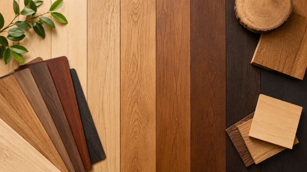
Wood Color Chart: Hex Codes and RGB Values for Common Species
If you’re trying to match paint, digital mockups, or interior design software to real wood, you need actual numbers rather than vague descriptions like “medium brown.” Below is a wood colors chart with approximate wood color hex and wood color rgb references for the most common species. Keep in mind these are averages — actual color shifts based on finish, lighting, and age.
| Wood Type | Approx. Hex Code | Approx. RGB | Undertone |
|---|---|---|---|
| Light Oak | #D8B98C | 216, 185, 140 | Warm |
| Maple | #E3C299 | 227, 194, 153 | Warm |
| Natural Ash | #D9CBB8 | 217, 203, 184 | Cool-neutral |
| Pine | #DEB887 | 222, 184, 135 | Warm |
| Teak | #A47551 | 164, 117, 81 | Warm |
| Walnut | #5C4033 | 92, 64, 51 | Warm-deep |
| Cherry | #7B3F2D | 123, 63, 45 | Warm-red |
| Mahogany | #4E2A20 | 78, 42, 32 | Warm-deep |
| Rosewood / Palisander | #3B2415 | 59, 36, 21 | Warm-red-deep |
| Ebony | #2C1B18 | 44, 27, 24 | Cool-deep |
A note on accuracy: no single wood hex code can perfectly represent a natural material, because grain, sheen, and lighting all shift how a color reads to the eye. Treat this wood color code table as a planning tool, not a paint-matching guarantee — always check a physical sample before committing to cabinetry or flooring.
A Closer Look at the Most Common Wood Species and Their Colors
Oak Wood Tones
Oak is probably the most widely used wood in furniture and flooring, and for good reason — it’s durable, has a distinctive open grain, and takes stain well. Natural oak wood tones run from pale honey to a deeper amber-gold, and it’s a genuinely warm wood by default. White oak leans slightly cooler and grayer than red oak, which explains why two “oak” floors from different suppliers can look surprisingly different side by side.
Walnut Wood Tones
Walnut wood tones sit at the deep end of the spectrum — rich chocolate brown, sometimes with faint purplish or gray undertones depending on the cut. Walnut is often treated as a “neutral” dark wood because it pairs well with both warm and cooler tones, which is part of why it’s such a popular choice for statement furniture pieces like dining tables and credenzas.
Maple
Maple is one of the palest woods available, with a smooth, tight grain and a creamy yellow-white base. It’s a favorite in Scandinavian and minimalist interiors because it reflects light well and keeps a room feeling airy.
Teak
Teak has a golden-brown, slightly reddish tone and a naturally oily texture that makes it popular for outdoor furniture. It ages into a silvery gray if left untreated outdoors, which is a completely normal weathering process rather than damage.
Cherry and Mahogany
Both cherry and mahogany fall into the dark wood types category once they mature, though cherry starts lighter and deepens with age while mahogany begins dark and stays that way. Mahogany has long been associated with formal, traditional furniture — think antique writing desks and grand dining sets.
Rosewood and Palisander Wood
Rosewood, often called palisander wood in European markets, is a dense, richly colored hardwood with deep reddish-brown to near-black tones and striking dark grain streaks. It’s prized in high-end furniture and musical instruments, and it’s also a popular material in fine jewelry and decorative accessories — searches for things like holzschmuck palisander (palisander wood jewelry, a term used in German-speaking markets) reflect how sought-after this wood is for small, detail-oriented pieces where its color and grain really stand out. Because genuine rosewood species are regulated under international trade protections in many regions, always confirm that any palisander product you’re buying is sourced from a legal, sustainable supplier.
Ash and Pine
Ash is light and slightly cooler than oak, often used in modern furniture for its subtle straight grain. Pine is soft, pale yellow, and budget-friendly, though it dents more easily than hardwoods and darkens noticeably with age and UV exposure.
How to Mix Wood Tones Without It Looking Like a Mistake
Knowing how to mix wood tones is really about intention. A room full of wood that was clearly chosen at random reads as cluttered; a room with two or three coordinated tones reads as designed, even if the furniture came from five different stores over five years.
Here’s a simple framework for mixing wood tones successfully:
- Pick a dominant tone first. This is usually your floor, or your largest furniture piece if you have carpet. Everything else gets measured against this.
- Add one contrasting tone. A dark walnut coffee table against light oak floors, for instance, creates depth without visual chaos.
- Repeat your undertone. If your dominant wood is warm, keep secondary pieces warm too, even if they’re a different shade.
- Use a neutral bridge. Black metal legs, a patterned rug that contains both tones, or white walls all help tie mismatched pieces together.
- Limit yourself to two or three tones per room. More than that, and even well-matched wood combinations start to look busy.
This approach works whether you’re talking about wood and color combinations in a single piece of furniture or wood color combinations across an entire open-plan space.
Mixing Dark and Light Wood Furniture in a Living Room
Mixing dark and light wood furniture in a living room is one of the most common design challenges people search for, and it’s also one of the easiest to solve once you understand contrast ratios. A living room with a light oak floor, a dark walnut media console, and a medium-toned coffee table creates a natural visual hierarchy — your eye moves from light to dark without getting stuck anywhere.
The mistake most people make is going 50/50: half the room in light and dark wood with no clear majority tone. That split reads as indecisive. Instead, let one tone dominate roughly 60–70% of the wood surfaces in the room, with the contrasting tone used for one or two standout pieces, like a media unit, a set of shelves, or picture frames.
If you’re nervous about committing, start small. Swap in a dark wood tray or a set of dark picture frames against a light wood shelf before you invest in a full wood furniture colors overhaul. It’s a low-risk way to test whether a contrast you’re considering actually works in your specific lighting.
Do Maple and Oak Go Together?
This is a question that comes up constantly, and the short answer is yes — do maple and oak go together? Generally, absolutely. Both are warm, light-to-medium toned woods with fairly subtle grain patterns, so they blend rather than compete. The main thing to watch is finish: a maple piece with a yellow-heavy varnish next to a very pale, almost gray-washed oak can look slightly off, because you’ve accidentally mixed undertones even within the same “light wood” category. Stick to natural or lightly warmed finishes on both, and the pairing works in kitchens, bedrooms, and living spaces alike.
Mixed Wood Flooring Ideas
If you’re renovating and want floors with more personality than a single uniform tone, mixed wood flooring ideas are worth considering — but they require more planning than furniture mixing because floors are permanent and cover a huge visual area.
A few approaches that actually hold up over time:
- Herringbone or chevron patterns using two closely related tones (like natural oak and slightly smoked oak) rather than high-contrast pairings.
- Transitional flooring, where one wood tone flows into another between rooms — useful for open-plan homes that still want subtle zoning.
- Border and inlay details, where a darker wood frames a lighter central floor, common in more traditional or period homes.
- Reclaimed wood mixes, where planks of varying but complementary tones are used intentionally for a rustic, collected-over-time look.
Whatever direction you choose, order physical samples and lay them out under your home’s actual lighting before finalizing anything — showroom lighting is notoriously flattering and rarely matches how a floor will look in your space.
Furniture Colour Combination: Pairing Wood With Paint
Wood doesn’t exist in isolation — it sits against walls, cabinetry, and upholstery, so furniture colour combination planning has to include paint and fabric, not just other wood pieces.
For a reliable wood color combination paint approach:
- Warm woods (oak, pine, cherry) pair beautifully with soft whites, sage green, terracotta, and warm grays.
- Cool woods (ash, gray oak) look sharp against true white, charcoal, navy, and cooler greens like eucalyptus.
- Dark woods (walnut, mahogany, palisander) benefit from lighter wall colors that let the wood read as a feature rather than disappearing into a dark room.
If you’re combining two pieces of furniture in different woods, a wooden colour combination that shares at least one visual trait — similar grain visibility, similar sheen, or matching hardware finishes — will look coordinated even if the actual shades differ. Brushed brass or matte black hardware, for instance, is often used across multiple wood tones in a single room specifically to create that thread of consistency.
Quick Reference: Types of Wood by Color Family
| Color Family | Common Woods | Typical Use |
|---|---|---|
| Very Light | Maple, Birch, Ash | Scandinavian, minimalist interiors |
| Light-Medium | Oak, Pine | Farmhouse, coastal, transitional |
| Medium-Warm | Teak, Cherry (young) | Mid-century modern |
| Deep Warm | Walnut, Cherry (aged), Mahogany | Traditional, statement furniture |
| Very Deep | Rosewood/Palisander, Ebony | Fine furniture, accents, jewelry |
Frequently Asked Questions
What are the most popular wood tones that go together? Oak and walnut is the most common pairing right now, since it combines a light warm base with a deep warm accent. Maple and oak also work well together because they share a similar light, warm undertone.
How do I know if my wood tones are warm or cool? Look at the wood in natural daylight. If it has a yellow, orange, or red cast, it’s warm. If it looks gray, ash, or slightly blue-toned, it’s cool. This single check solves most wood colour mismatches before they happen.
Can I mix more than two wood tones in one room? You can, but three tones is generally the practical limit. Beyond that, even well-chosen different wood colors start competing with each other for attention.
Do all wood colors get darker with age? Not all, but many do — cherry and pine both deepen noticeably over time due to light exposure, while species like walnut can actually lighten slightly. It’s worth researching your specific type of wood before assuming its current shade is permanent.
Is palisander wood the same as rosewood? Yes, palisander is essentially a regional name for certain rosewood species, commonly used in European and South American markets. It’s valued for its deep color and fine grain in both furniture and smaller decorative items.
What’s a safe wood color palette for resale value? Neutral, warm-toned woods like oak and walnut tend to have the broadest appeal and are less likely to feel dated compared to heavily gray-washed or very trend-specific finishes.
Final Thoughts
Getting wood colors right in a room isn’t about memorizing every species — it’s about training your eye to spot undertone first and shade second. Once you can look at two pieces of furniture and immediately tell whether they’re both warm or both cool, most of the guesswork around mixing wood tones disappears. Start with your dominant surface, choose one confident contrast, and let a neutral element tie the room together. That’s really the whole formula.