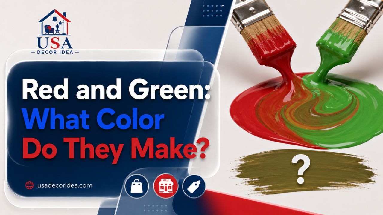
Stand in a paint store long enough and you’ll hear someone ask the same question in a dozen different ways: what does red and green make when you put them together? A parent helping with a school art project. A designer picking a logo palette. Someone decorating for the holidays who wants more than “Christmas cliché” on their walls. All roads lead back to the same pair of colors.
I’ve spent years working with color theory in both print and digital design, and if there’s one combination that trips people up more than any other, it’s this one. Red and green sit directly across from each other on the color wheel, which makes them complementary colors — and complementary pairs behave in ways that surprise people who haven’t studied pigment or light before.
This article walks through the science, the visual effects, and the practical applications of red and green so you’re not left guessing the next time someone asks what color does red and green make, or you’re staring at a red and green color palette trying to figure out if it’ll actually work for your project.
The Short Answer: It Depends on Light or Paint
Here’s the part that confuses almost everyone. The answer to what does red and green make changes completely depending on whether you’re mixing light or mixing pigment.
In pigment (paint, ink, dye): Red and green mixed together produce a muddy brown or a dull olive-ish tone. This is subtractive mixing — each pigment absorbs certain wavelengths and reflects others, and when you combine them, you’re subtracting more and more light from what bounces back to your eye.
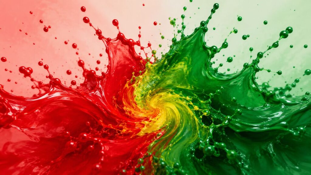
In light (screens, RGB systems): Red and green make yellow. This is additive mixing. Your monitor, phone screen, and TV all rely on red, green, and blue light combining in different intensities to create every color you see, and red plus green light lands squarely on yellow.
So if someone asks what does green and red make and you’re talking about crayons or wall paint, the honest answer is: something in the brown-to-olive family, and rarely anything pretty. If you’re talking about pixels, red and green make what color? Yellow, every time.
| Mixing Method | Red + Green Result | Where You’d See This |
|---|---|---|
| Pigment (subtractive) | Muddy brown / olive | Paint, ink, dye, makeup |
| Light (additive) | Yellow | TV screens, phone displays, stage lighting |
| Digital RGB values | Yellow (255,255,0 style outputs) | Web design, graphic software |
This table alone answers most of the searches people run when they type in red and green make what color — but the “why” behind it matters just as much, so let’s get into that.
Why Pigment and Light Don’t Play by the Same Rules
Light is made of wavelengths. Red light sits around 620-750 nanometers, green around 495-570. When you shine both onto the same spot, your eye’s cone cells detect both wavelengths simultaneously, and your brain interprets that combined signal as yellow. There’s no actual yellow wavelength involved — it’s a perceptual trick, and a reliable one.
Pigment works in reverse. A red pigment looks red because it absorbs most wavelengths except red, which it reflects back at you. A green pigment does the same but for green. Combine the two pigments and each one is stealing light from the other — red pigment absorbing the green wavelengths, green pigment absorbing the red ones. What’s left over is a narrow band of reflected light, which usually reads as brown, gray-brown, or a swampy olive depending on the exact shades you started with.
This is the entire reason red and green mixed on a canvas never gives you anything close to what red and green mixed on a screen gives you. Different physics, different outcome, same two starting colors.
The Red and Green Color Palette, Broken Down
A red green color palette isn’t one fixed thing — it shifts dramatically depending on the exact shades you pick. Bright red and bright green together read as bold, high-energy, and sometimes jarring. Deep red and forest green read as classic, warm, and traditional. Coral and sage read as soft and modern.
Here’s a practical red and green color palette breakdown by mood:
- Classic and festive: Crimson red (#DC143C) + forest green (#228B22) — the pairing everyone associates with December
- Bold and modern: Cherry red (#D2042D) + emerald green (#50C878) — used often in tech branding and sportswear
- Earthy and calm: Terracotta (#E2725B) + sage green (#9CAF88) — popular in home décor right now
- High contrast/warning: Fire engine red (#CE2029) + neon green (#39FF14) — used in safety signage and gaming interfaces
- Muted and vintage: Brick red (#CB4154) + olive (#808000) — common in retro branding
A red and green color palette built around desaturated, closer-in-value tones will always feel calmer than one built around fully saturated versions of both colors. That’s a rule that holds whether you’re picking wall paint, a wardrobe, or a website theme.
When people search for a green red color palette instead of red green, they’re usually approaching from the opposite direction — starting with a green base and looking for a red accent, rather than the other way around. The palette logic is identical either way; only the starting point in your head changes.
Red to Green Gradient: A Different Animal Entirely
A gradient is not the same conversation as mixing. A red to green gradient doesn’t physically blend the pigments — it transitions through the color wheel, and depending on the software or method, that transition might pass straight through brown/olive tones (a direct linear blend) or swing through yellow and orange first (a hue-based blend, which is how most design software defaults to handling it).
This matters a lot for anyone building a green to red gradient in Photoshop, Figma, CSS, or a data visualization tool:
- A linear RGB blend from red to green passes through brownish, desaturated midtones — because you’re literally averaging the pigment-style values.
- A hue-rotation blend (common in CSS
hueinterpolation or gradient tools that work in HSL) swings through orange and yellow on its way from red to green, producing a much more vibrant, traffic-light-style transition.
If you’ve ever built a green to red color scale for a dashboard — the kind used in heat maps, spreadsheets, or performance indicators where green means “good” and red means “bad” — you’ve probably noticed this exact issue. A naive red to green gradient can produce a swampy, unreadable middle zone. Most well-designed data visualization tools route the transition through yellow specifically to avoid that dead zone, which is why a green to red gradient in Excel or Google Sheets conditional formatting usually looks noticeably better than one built with a basic linear interpolation.
If you’re designing your own green to red color scale, test the midpoint specifically. That’s where things go wrong most often.
What “Greenish Red” Actually Means (And Why It’s a Trick Question)
Here’s a fun one for anyone who’s spent time in color theory: greenish red isn’t really a color you can produce, and there’s a biological reason why. Red and green are opponent colors in human vision — the same retinal mechanism that lets you see red also suppresses green, and vice versa. This is why you can imagine a reddish-orange or a reddish-purple without much trouble, but “greenish red” doesn’t resolve into a mental image the way those other combinations do.
This opponent-process theory, first proposed by physiologist Ewald Hering, explains a lot of what feels intuitive about red and green as colors: they read as opposites not just symbolically (stop/go, danger/safe) but at the level of how your eyes and brain are wired. So when a client asks for a “greenish red” swatch, what they usually mean is a red with warm undertones (leaning orange) or one with cooler undertones (leaning toward maroon or brick) — not an actual red-green hybrid, because your visual system won’t let you perceive one.
Where Red and Green Combination Shows Up in the Real World
A red and green combination isn’t limited to holiday décor, even though that’s the association most people jump to first.
Branding and logos: Companies like Sprite (in some regional branding), certain grocery chains, and holiday-adjacent retail brands lean into a green red combination specifically because it’s memorable and high-contrast. Contrast is genuinely useful in branding — complementary colors sit far apart on the wheel, so they naturally pop against each other in a way that same-family colors don’t.
Traffic and safety systems: The entire concept of “stop” and “go” is built on a red green combination, and it’s one of the most globally recognized color-coded systems in existence. This wasn’t an accident — early traffic signal designers picked red and green specifically because they’re easy to distinguish from a distance, even though roughly 8% of men with red-green color blindness struggle with this exact pairing (more on that below).
Fashion: A red and green combination shows up seasonally in fashion collections, often softened through muted tones (burgundy and sage, rust and moss) rather than the fully saturated version.
Interior design: Designers use a green red combination in smaller doses — a red accent chair against sage green walls, for example — because full-saturation versions of both colors in equal amounts tend to overwhelm a room.
Food and agriculture branding: Think tomato sauce jars, watermelon packaging, and holiday food products — the red and green mix colour scheme signals “fresh” and “natural” in ways that other palettes don’t manage as convincingly.
Accessibility: The Part Most Color Guides Skip
This is the section I think matters most, and it’s the one most articles on this topic leave out entirely.
Red-green color blindness (technically deuteranopia and protanopia) affects roughly 1 in 12 men and 1 in 200 women of Northern European descent, according to data from the National Eye Institute. For these individuals, a red and green colour mix or a red green color palette used for anything functional — charts, warning labels, buttons — can be genuinely unreadable, not just aesthetically unappealing.
Practical fixes if you’re designing anything functional with this palette:
- Never rely on red and green alone to convey meaning (add icons, labels, or patterns too)
- Test your green and red colour mix using a color blindness simulator before shipping a design
- Increase the value (lightness/darkness) difference between your red and green, not just the hue difference — this helps far more than people expect
- Avoid placing red and green directly adjacent in small text or thin lines, where the distinction matters most
If you’re building anything past a decorative or personal use case — a dashboard, a public sign, an app interface — this isn’t optional advice. It’s the difference between a design that works for everyone and one that quietly fails for millions of people.
Common Mistakes People Make With This Palette
I’ve reviewed a lot of amateur design work built around a red and green combination, and the mistakes tend to repeat:
- Using both at full saturation in large blocks. It reads as loud, sometimes aggressive, rarely sophisticated.
- Ignoring undertone. A blue-based red next to a yellow-based green clashes in a way that’s hard to name but easy to feel. Match the undertones (both warm or both cool) for a combination that actually looks intentional.
- Treating red and green mix colour choices as automatically “Christmas.” Context, proportion, and the exact shades chosen change the entire feeling. Terracotta and sage read nothing like crimson and forest green.
- Forgetting the 60-30-10 rule. A green red combination usually works best when one color dominates (60%), the second supports (30%), and a neutral or accent color fills the rest (10%).
Red and Green Through History and Culture
Red and green as a symbolic pair predates modern branding by a long way. Holly berries and evergreen boughs — red and green together in nature — were used in winter solstice celebrations long before they became associated with any specific holiday. Christian traditions later absorbed and reinforced that association, which is why the red and green combination reads as “Christmas” across so much of the Western world today.
Outside the holiday context, red and green carry different meanings depending on culture. In some South Asian traditions, red and green together signal fertility and prosperity, especially in bridal and festival textiles. In heraldry, the two colors were historically kept apart more often than combined, since medieval color theory (well before modern optics) already recognized them as visually competing rather than complementary in a decorative sense.
FAQ: Quick Answers to Common Questions
What color does red and green make? In paint or pigment, red and green make a muddy brown or olive tone. In light — like on a screen — red and green make yellow.
What does red and green make when mixed as paint? A dull brown, grayish-brown, or olive shade, depending on the exact reds and greens you start with.
Red + green = what color on a computer screen? Yellow. RGB light mixing is additive, and red plus green light lands on yellow.
Is there such a thing as greenish red? Not really — red and green are opponent colors in human vision, so your brain can’t process a true red-green hybrid the way it can with other color combinations.
Why do red and green look “Christmas” to almost everyone? Cultural reinforcement over centuries, starting with pre-Christian use of holly and evergreen and continuing through modern retail and media.
What’s a good red and green color palette for a website? Start with one dominant color (usually the neutral-adjacent one, like a muted sage) and use the second as an accent only — full saturation on both tends to overwhelm a screen.
Does a red to green gradient always pass through brown? Only if it’s a straight linear RGB blend. Gradients built in HSL or through hue rotation typically pass through yellow and orange instead, which looks far more natural.
Are red and green hard to see for colorblind users? Yes — red-green color blindness is the most common form of color vision deficiency, so any red green color palette used functionally should include a backup cue like labels or icons.